CSS 并不难(你只是缺少这些基础知识)- 掌握基础(第 2 部分)
来源:dev.to
时间:2024-12-05 16:01:16 289浏览 收藏
学习知识要善于思考,思考,再思考!今天golang学习网小编就给大家带来《CSS 并不难(你只是缺少这些基础知识)- 掌握基础(第 2 部分)》,以下内容主要包含等知识点,如果你正在学习或准备学习文章,就都不要错过本文啦~让我们一起来看看吧,能帮助到你就更好了!
感谢大家对上一篇文章的评论,这确实意义重大。我希望你能从这篇文章中学到一两件事。
在本文中,我们将探讨 css 中的两个基本概念——定位和布局。定位和布局是创建具有视觉吸引力和功能性的网页的核心。掌握这些概念可以让您制作出增强用户体验的响应式设计。最后,您将了解如何使用这些技术像专业人士一样构建您的网页。
- 定位和布局
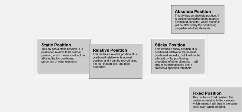
css 定位控制元素在网页上的定位或放置方式。如果适用,定位会受到顶部、底部、左侧和右侧偏移值的影响。有 5 个主要的 css position 值;
1。静态: 默认情况下,所有 html 元素都是静态定位的。这仅仅意味着元素不变,不移动,并且不受上、下、左、右偏移值的影响。
2。相对: 元素相对于其正常位置定位。
3。绝对: 元素相对于其最近的祖先(父级)或视口定位。
4。已修复: 元素相对于视口定位并在滚动期间保持固定。
5。粘性: 粘性定位允许元素根据滚动位置和偏移值上、下、左、右在相对位置和固定位置之间切换。
下面是解释 css 定位的插图。
这是帮助使插图栩栩如生的代码。欢迎自行复制修改。
    css positioning


            static position
            this div has a static position. it is positioned relative to its normal position, which means it will not be affected by the positioning properties of other elements.


            relative position
            this div has a relative position. it is positioned relative to its normal position, and it can be moved using the top, bottom, left, and right properties.


            absolute position
            this div has an absolute position. it is positioned relative to the nearest positioned ancestor, which means it will be affected by the positioning properties of other elements.


            fixed position
            this div has a fixed position. it is positioned relative to the viewport, which means it will stay in the same place even when scrolling.


            sticky position
            this div has a sticky position. it is positioned relative to the nearest positioned ancestor, but it will not be affected by the positioning properties of other elements. it will stay in its original place until it crosses a specified threshold.
*{
    margin: 0;
    padding: 0;
    box-sizing: border-box;
}

body{
    font-family: arial, sans-serif;
    background-color: #f2f2f2;
    display: grid;
    place-content: center;
    min-height: 100vh;
}

.container{
    width: 100%;
    max-width: 1200px;
    height: auto;
    display: grid;
    grid-template-columns: repeat(auto-fill, minmax(300px, 1fr));
    border: 1px solid red;
    gap: 20px;
    padding: 20px;
}

.static{
    background-color: #ccc;
    padding: 20px;
    border: 1px solid black;
    width: 300px;
    position: static;

}

.relative{
    background-color: #ccc;
    padding: 20px;
    border: 1px solid black;
    width: 300px;
    position: relative;
    top:30px;
    right: 30px;

}

.absolute{
    background-color: #ccc;
    padding: 20px;
    border: 1px solid black;
    width: 300px;
    position: absolute;
    top: 30px;
    right: 100px;
}

.fixed{
    background-color: #ccc;
    padding: 20px;
    border: 1px solid black;
    width: 300px;
    position: fixed;
    bottom: 0;
    right: 0;
}

.sticky{
    background-color: #ccc;
    padding: 20px;
    border: 1px solid black;
    width: 300px;
    position: sticky;
    top: 0;
    right: 0;
}
— 暂停,深呼吸,然后继续!!—
- css 布局
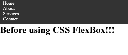
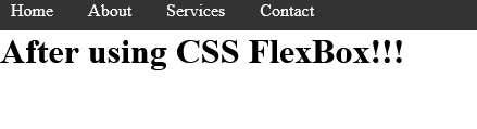
1。 flexbox:这是一种一维布局方法,用于在单轴(水平和垂直)上布局项目。
flexbox 的特点
- display: flex - 这会为容器创建一个弹性框。
- align-items: center - 这控制容器的垂直对齐。
- justify-content: space- between - 这控制容器的水平对齐方式。
- 间隙:在不需要边距的情况下增加弹性项目之间的间距。
这是一个简单导航栏的前后对比
navigation bar using css flexbox
* {
  margin: 0;
  padding: 0;
  box-sizing: border-box;
}

body {
  min-height: 100vh;
}

li {
  list-style: none;
}
a {
  text-decoration: none;
  color: white;
}
nav {
  background-color: #333;
  color: #fff;
  padding: 10px;
}

ul {
  display: flex;
  align-items: center;
  gap: 2rem;
}
结果:
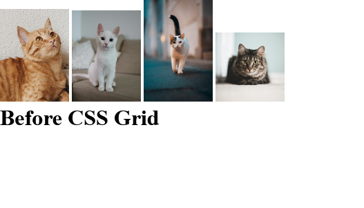
2。网格:这是一种用于创建行和列的二维布局方法。
特点
- display: grid - 这会为容器创建一个网格。
- grid-template-columns/grid-template-rows - 这定义了容器的行或列。
- repeat(2, 1fr) - 这将创建 2 个等宽列。
- 间隙:10px-增加网格项目之间的间距。
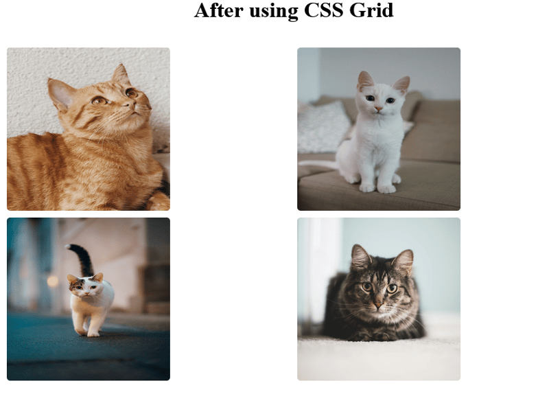
这是我在 unsplash 上找到的一些猫照片的前后对比。
css grid using cat photos


* {
  margin: 0;
  padding: 0;
  box-sizing: border-box;
}

body {
  min-height: 100vh;
}

.container {
  margin: 0 auto;
  width: 950px;
  padding: 1rem;
}

.cat-photos {
  padding: 2rem;
  display: grid;
  grid-template-columns: repeat(2, 1fr); /* Creates 2 equal-width columns */
}

img {
  border: 5px solid white;
  border-radius: 10px;
  width: 250px;
  height: 250px;
}
结果:
比较表
| feature | flexbox | grid |
|---|---|---|
| axis | one-dimensional | two-dimensional |
| alignment | horizontal/vertical | rows and columns |
| best for | navigation bars | layouts like dashboards |
| flexibility | better for small components | better for page layouts |
定位和布局是css的基础。了解何时以及如何使用它们不仅会让您的造型体验变得更加轻松,而且更加愉快和高效。虽然本文将带您开始使用 flexbox 和 grid,但我很快就会发布更深入的指南,探索它们的高级功能、提示和技巧。请继续关注!
这就是掌握css基础知识的总结!我希望你喜欢阅读这篇文章,就像我喜欢写它一样。但在我们分别之前,我很想听听你的消息:
您的项目更喜欢哪种 css 布局方法 - flexbox 还是 grid?为什么?
欢迎在下面的评论中分享您的想法。
再见了!!!!
以上就是本文的全部内容了,是否有顺利帮助你解决问题?若是能给你带来学习上的帮助,请大家多多支持golang学习网!更多关于文章的相关知识,也可关注golang学习网公众号。
-
502 收藏
-
501 收藏
-
501 收藏
-
501 收藏
-
501 收藏
-
422 收藏
-
449 收藏
-
105 收藏
-
285 收藏
-
111 收藏
-
文章 · 前端 | 3天前 | 定时器 · 前端 · 性能排查 · 接口请求 · 轮询 · setInterval · setInterval 页面可见性 clearInterval 前端轮询 请求堆积 定时器清理490 收藏
-
253 收藏
-
295 收藏
-
128 收藏
-
365 收藏
-
350 收藏
-
文章 · 前端 | 4天前 | 前端 · javascript · URL参数 · 列表筛选 · 页面状态 · 前端 筛选条件 列表页 history.replaceState URLSearchParams 刷新还原348 收藏
-

- 前端进阶之JavaScript设计模式
- 设计模式是开发人员在软件开发过程中面临一般问题时的解决方案,代表了最佳的实践。本课程的主打内容包括JS常见设计模式以及具体应用场景,打造一站式知识长龙服务,适合有JS基础的同学学习。
- 立即学习 543次学习
-

- GO语言核心编程课程
- 本课程采用真实案例,全面具体可落地,从理论到实践,一步一步将GO核心编程技术、编程思想、底层实现融会贯通,使学习者贴近时代脉搏,做IT互联网时代的弄潮儿。
- 立即学习 516次学习
-

- 简单聊聊mysql8与网络通信
- 如有问题加微信:Le-studyg;在课程中,我们将首先介绍MySQL8的新特性,包括性能优化、安全增强、新数据类型等,帮助学生快速熟悉MySQL8的最新功能。接着,我们将深入解析MySQL的网络通信机制,包括协议、连接管理、数据传输等,让
- 立即学习 500次学习
-

- JavaScript正则表达式基础与实战
- 在任何一门编程语言中,正则表达式,都是一项重要的知识,它提供了高效的字符串匹配与捕获机制,可以极大的简化程序设计。
- 立即学习 487次学习
-

- 从零制作响应式网站—Grid布局
- 本系列教程将展示从零制作一个假想的网络科技公司官网,分为导航,轮播,关于我们,成功案例,服务流程,团队介绍,数据部分,公司动态,底部信息等内容区块。网站整体采用CSSGrid布局,支持响应式,有流畅过渡和展现动画。
- 立即学习 485次学习