
手机壁纸提示词:黑金几何折光与顶部纯净空间
来源:17golang原创
时间:2026-11-12 13:33:05 459浏览 收藏
黑金几何折光做成手机壁纸时,最容易出现两个问题:金色高光铺满全屏,锁屏时间没有落脚处;折面细节太多,主屏图标一放上去就显得拥挤。更稳的做法是把折光主体压到画面下方,让顶部保持连续、低细节的深黑区域,再用一条受控的金色光路承担视觉焦点。下面给出一张主壁纸和一张主屏变体,两张图都是原创9:16位图,不含文字、Logo、设备边框或界面元素。
主壁纸预览与下载
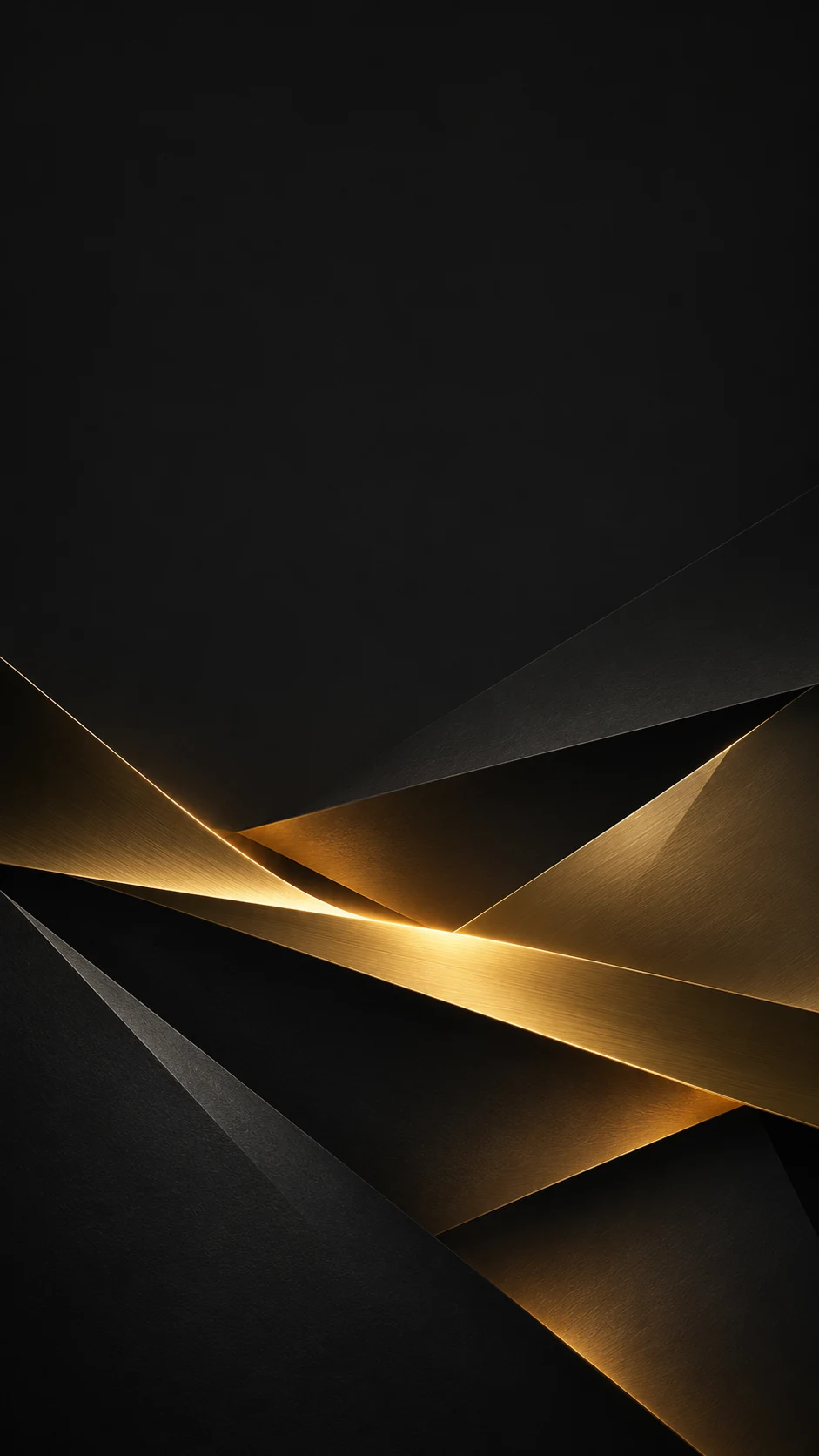
主图只保留一个视觉动作:黑色几何折面从底部向中心展开,金色反光沿折痕穿过,但没有把亮部推到顶部。顶部约四分之一使用深黑到石墨灰的缓慢过渡,适合放时间和状态信息;主体也没有贴住左右边缘,系统自动裁切时更容易保住折光中心。
主壁纸中文提示词
生成一张9:16竖屏手机壁纸,主题是黑色与金色的几何折光。画面由深黑、石墨色的抽象折叠平面组成,折面从下方三分之一向画面中心展开,一条细而受控的金色反光沿折痕斜向穿过下半区,边缘清晰但不锋利刺眼。顶部约四分之一保持连续、低细节、低对比的纯黑到石墨灰渐变,适合锁屏时间与状态信息;主体不要贴近顶部和左右边缘,保留宽松负空间。整体是高级、克制的抽象数字壁纸,具有缎面金属和哑光纸张的细微质感,黑色占主导,金色只作为焦点。无文字、无字母、无数字、无标志、无水印、无二维码、无软件界面、无设备外框、无时钟、无人、无产品。避免满屏金色、过曝光晕、霓虹色、复杂装饰、随机符号和拥挤顶部。
主壁纸英文提示词
Create a 9:16 portrait smartphone wallpaper based on black and metallic-gold geometric light folds. Build the image from deep-black and graphite abstract folded planes, expanding from the lower third toward the center. Add one thin, controlled golden reflection running diagonally along a fold in the lower half; keep the edges defined but not harsh or glaring. Keep roughly the upper quarter as a continuous, low-detail, low-contrast gradient from pure black to graphite, reserved for a lock-screen clock and status information. Do not place the subject near the top or side edges; preserve generous negative space. Aim for a premium, restrained abstract digital wallpaper with subtle satin-metal and matte-paper texture. Black should dominate and gold should remain a focused accent. No text, letters, numbers, logos, watermark, QR code, software interface, device frame, clock, people, or products. Avoid full-screen gold, blown-out bloom, neon colors, decorative clutter, random symbols, and a busy top region.
两种语言需要保持同一组硬条件:lower third、upper quarter low-detail、one controlled golden reflection。如果只写“黑金高级感”,生成结果很容易变成金色海报;把主体位置、亮部数量和顶部留白写清楚,才更像可用的手机壁纸。
折面、光路和顶部留白怎样一起控制
黑金画面的质感不是靠增加装饰获得的,而是靠黑色层次、折面方向和一处亮部互相衬托。重新生成时建议一次只改一个变量:
| 想要的效果 | 提示词调整 | 避免同时加入 |
|---|---|---|
| 黑色更有层次 | deep black、graphite planes、soft shadow gradients | pure black everywhere、high-contrast noise |
| 金光更集中 | one thin golden reflection、controlled highlight、lower half | golden glow across the whole frame、multiple light sources |
| 折面更清楚 | faceted edges、satin-metal folds、subtle matte texture | sharp shards、busy micro-detail、glass sculpture |
| 顶部适合锁屏 | upper quarter low-detail、quiet black negative space、continuous gradient | bright object in the clock zone、fold reaching the top edge |
如果画面太暗,可以先把 graphite 和 muted champagne highlight 加到中间调,不要直接扩大金色高光。如果顶部仍然出现折线,把“quiet black negative space”改成“nearly uninterrupted dark field”,并明确折面从下方开始。
构图变体预览与下载
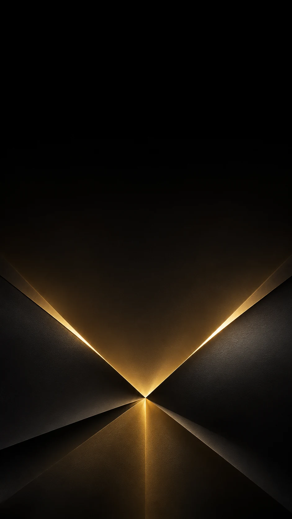
变体不只是把主图换成另一种颜色,而是把两块折面改为更接近对称的结构,让金色光路在下方中央收束。顶部和两侧都减少细碎纹理,图标落在黑色连续区域时不容易被背景干扰,因此更适合主屏。
变体中文提示词
生成一张9:16竖屏手机壁纸,延续黑色与古董金色的几何折光主题,但构图与主图明显不同。两块深黑和石墨色的抽象折叠平面从左右下方向下方中央汇合,在接缝处形成一条窄而柔和的金色棱镜光;视觉焦点位于画面下半区,顶部约四分之一几乎保持纯黑,只留下极轻的渐变,适合主屏状态栏和图标。折面具有细腻的缎面材质与柔软阴影,边缘干净,金色只在接缝处出现,不铺满画面。整体简洁、对称、克制。无文字、无字母、无数字、无标志、无水印、无二维码、无软件界面、无设备外框、无时钟、无人、无产品。避免亮部到达顶部、霓虹色、玻璃碎片、装饰线条、随机符号和复杂纹理。
变体英文提示词
Create a 9:16 portrait smartphone wallpaper that keeps the black and antique-gold geometric light-fold theme but uses a visibly different composition. Let two deep-black and graphite abstract folded planes converge from the lower left and lower right toward a point near the lower center, forming one narrow, soft prism of golden light along the seam. Keep the focal point in the lower half. Make roughly the upper quarter almost pure black with only a very subtle gradient, leaving room for a home-screen status bar and icons. Give the folds a fine satin texture and soft shadows with clean edges; gold should appear only along the seam, never across the whole frame. Keep the composition simple, balanced, and restrained. No text, letters, numbers, logos, watermark, QR code, software interface, device frame, clock, people, or products. Avoid highlights reaching the top, neon colors, glass shards, decorative lines, random symbols, and complex texture.
变体的关键是“下方收束、顶部近乎纯黑”。如果图标较多,可以把 almost pure black 换成 continuous low-contrast dark field,让顶部和右上区域更均匀;不要为了填空再增加第二条金色光线。
锁屏和主屏的裁切建议
- 锁屏时间较大:优先使用主图,把顶部纯净区保持在四分之一以上;若系统自动放大,先缩小折面主体再裁切。
- 主屏图标较多:优先使用变体,减少图标所在区域的细碎折线和金色高光。
- 屏幕比例更窄:保住下方中央的光路,不要让自动裁切把金色接缝切到边缘。
- 画面显得太黑:提高石墨灰中间调或加一点低强度香槟色反射,不要把顶部改成亮金色。
常见问题
为什么输入黑金,结果像金色宣传海报? 需要限制金色的数量,加入“one thin golden reflection”“black should dominate”和“gold only as a focused accent”,并明确不要文字、标志和装饰排版。
顶部留白为什么还是不干净? 只写“留白”不够,要同时写“upper quarter low-detail”“continuous dark field”和“folds start from the lower area”,让生成工具知道留白位于哪里、由什么组成。
折面太像玻璃碎片怎么办? 把材质改成 satin-metal、matte paper 和 soft shadow gradients,并在反向约束中加入“no glass shards、no sharp shards”。
主图和变体怎样保持同一主题? 两张图都保留黑色折面、单一金色光路、低细节顶部和无文字约束;只改变光路的走向与主体的对称关系,就能统一色彩又区分用途。
这组壁纸的重点不是把画面做得更亮,而是让黑色有层次、金色有边界、顶部有呼吸感。主图用斜向折光服务锁屏,变体用下方对称收束服务主屏;重新生成时先固定主体位置和亮部数量,再微调材质与中间调。
-
296 收藏
-
396 收藏
-
173 收藏
-
493 收藏
-
161 收藏
-
374 收藏
-
285 收藏
-
187 收藏
-
189 收藏
-
384 收藏
-
159 收藏
-
455 收藏
-
448 收藏
-
138 收藏
-
218 收藏
-
368 收藏
-
424 收藏
-

- 前端进阶之JavaScript设计模式
- 设计模式是开发人员在软件开发过程中面临一般问题时的解决方案,代表了最佳的实践。本课程的主打内容包括JS常见设计模式以及具体应用场景,打造一站式知识长龙服务,适合有JS基础的同学学习。
- 立即学习 543次学习
-

- GO语言核心编程课程
- 本课程采用真实案例,全面具体可落地,从理论到实践,一步一步将GO核心编程技术、编程思想、底层实现融会贯通,使学习者贴近时代脉搏,做IT互联网时代的弄潮儿。
- 立即学习 516次学习
-

- 简单聊聊mysql8与网络通信
- 如有问题加微信:Le-studyg;在课程中,我们将首先介绍MySQL8的新特性,包括性能优化、安全增强、新数据类型等,帮助学生快速熟悉MySQL8的最新功能。接着,我们将深入解析MySQL的网络通信机制,包括协议、连接管理、数据传输等,让
- 立即学习 500次学习
-

- JavaScript正则表达式基础与实战
- 在任何一门编程语言中,正则表达式,都是一项重要的知识,它提供了高效的字符串匹配与捕获机制,可以极大的简化程序设计。
- 立即学习 487次学习
-

- 从零制作响应式网站—Grid布局
- 本系列教程将展示从零制作一个假想的网络科技公司官网,分为导航,轮播,关于我们,成功案例,服务流程,团队介绍,数据部分,公司动态,底部信息等内容区块。网站整体采用CSSGrid布局,支持响应式,有流畅过渡和展现动画。
- 立即学习 485次学习